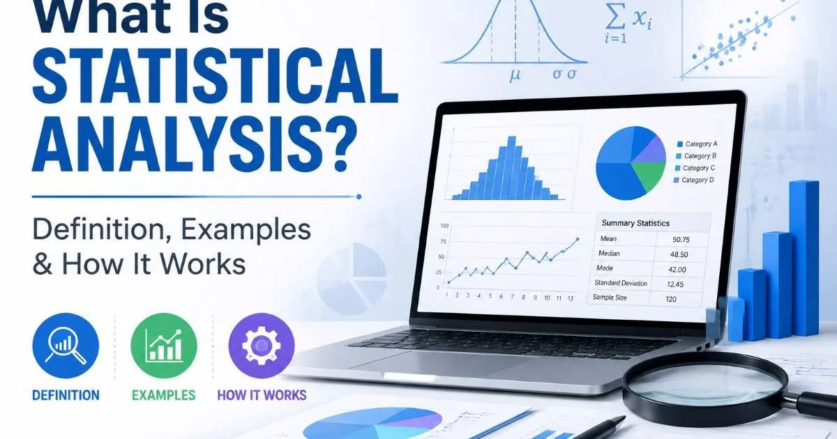
Statistical analysis is the process of collecting, organizing, and interpreting numerical data to uncover patterns, relationships, and meaningful insights. If you've ever looked at a chart and wondered what the numbers actually mean, or tried to figure out whether a trend in your data is real or just random noise, you've already brushed up against this field.
For beginner data learners, understanding the fundamentals can feel overwhelming at first. There are averages, variance, probability, correlations, and countless chart types to make sense of. But here's the good news: the core ideas behind data analysis basics are surprisingly intuitive once you strip away the jargon.
This guide breaks down everything you need to know in plain, accessible language. By the end, you'll have a solid foundation for reading, questioning, and interpreting data like someone who actually knows what they're looking at.
Key Takeaways
- Statistical analysis transforms raw numbers into understandable patterns and actionable insights.
- Averages and variance together describe both the center and spread of your data.
- Correlation does not prove causation, even when two variables move together perfectly.
- Probability helps you quantify uncertainty rather than eliminate it entirely.
- Visualizations like charts and tables make complex statistical results far easier to interpret.
What Is Statistical Analysis and How Does It Work?
Descriptive vs. Inferential Statistics
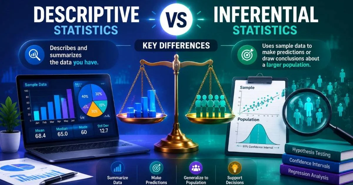
Statistical analysis falls into two broad categories. Descriptive statistics summarize what your data looks like right now: the average score on an exam, the range of temperatures last month, or the percentage of customers who bought a product. Inferential statistics go further by using a sample to make predictions or generalizations about a larger population. A political poll surveying 1,000 people to predict the preferences of millions is a classic example of inferential statistics in action.
The distinction matters because each type answers a different question. Descriptive statistics tell you "what happened," while inferential statistics try to answer "what does this mean for the bigger picture?" A foundational overview published by the National Institutes of Health explains how both types work together in research contexts. Beginners should get comfortable with descriptive measures first before moving into the inferential territory, where concepts like confidence intervals and hypothesis testing live.
The Basic Workflow
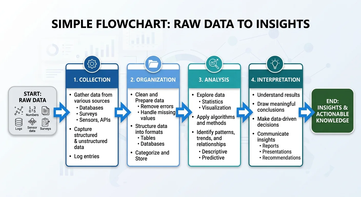
Every statistical analysis follows a general pattern. You start by defining a question, then collect relevant data, clean it (removing errors or duplicates), apply appropriate methods, and finally interpret the results. Skipping any step can lead to misleading conclusions. For instance, analyzing sales data without removing duplicate transactions would inflate your revenue figures and distort every downstream calculation.
Tools range from simple spreadsheets to programming languages like Python and R. For those just starting out, custom GPTs designed for math and statistics learning can walk you through calculations step by step. The tool you choose matters less than understanding what each step accomplishes. A calculator won't save you if you're asking the wrong question or feeding it dirty data.
Always clean your data before running any analysis. Even small errors compound into misleading results.
Core Concepts Explained: Averages, Variance, and Probability
Understanding Averages
When people say "average," they usually mean the arithmetic mean: add up all values and divide by the count. But averages and variance are a package deal; one without the other gives you an incomplete picture. Consider two classrooms where students scored an average of 75 on a test. In one classroom, every student scored between 70 and 80. In another, scores ranged from 30 to 100. Same average, radically different stories. The mean alone hides critical information.
The median (the middle value when data is sorted) and mode (the most frequent value) are alternative measures of central tendency. The median is especially useful when your data contains extreme outliers. If five employees earn $50,000 and their CEO earns $5 million, the mean salary looks impressive, but the median salary of $50,000 tells you what a typical employee actually takes home. Choosing the right average depends entirely on the shape of your data.
Variance and Spread
Variance measures how far each data point sits from the mean, on average. A low variance means your data clusters tightly around the center, while high variance means values are scattered widely. Standard deviation, which is simply the square root of variance, expresses spread in the same units as your original data. This makes it more intuitive for everyday interpretation. If exam scores have a standard deviation of 5 points, most students scored within 5 points of the mean.
Understanding spread is fundamental to interpreting data trends. A stock that averages 8% annual returns with low variance is a very different investment from one that averages 8% with wild swings between negative 20% and positive 40%. Both have the same mean, but the risk profiles are worlds apart. Variance gives you that context.
| Measure | What It Tells You | Best Used When | Sensitive to Outliers? |
|---|---|---|---|
| Mean | Average value | Data is symmetric | Yes |
| Median | Middle value | Data is skewed | No |
| Mode | Most common value | Categorical data | No |
| Variance | Spread from the mean | Comparing consistency | Yes |
| Standard Deviation | Spread in original units | Describing distributions | Yes |
| Range | Max minus min | Quick spread check | Yes |
Probability Basics
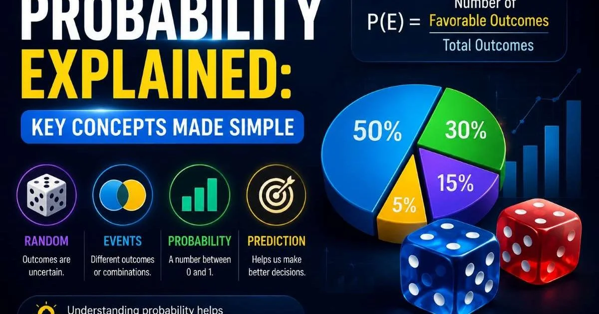
Probability and statistics are deeply intertwined. Probability assigns a numerical value (between 0 and 1) to the likelihood that an event will occur. A probability of 0 means impossible; a probability of 1 means certain. When a weather forecast says there's a 30% chance of rain, it means that in similar atmospheric conditions, rain occurred about 30 times out of 100 historically. It does not mean 30% of your city will get wet.
Probability forms the backbone of inferential statistics. When researchers report that a result is "statistically significant at p less than 0.05," they're saying there's less than a 5% probability the result occurred by random chance alone. This threshold is a convention, not a magic number. Understanding probability helps you evaluate claims critically rather than accepting every headline about a new scientific study at face value.
A p-value of 0.05 does not mean there is a 95% chance the hypothesis is true. It measures evidence against the null hypothesis.
Interpreting Trends, Correlations, and Charts
Reading Trends in Data
A trend is a general direction in which data moves over time. Sales increasing steadily each quarter, website traffic declining after a redesign, or global temperatures rising over decades are all examples of trends. Identifying trends requires looking beyond individual data points to see the bigger trajectory. A single bad quarter doesn't mean a business is failing, just as a single record-hot day doesn't confirm climate change. Trends emerge from patterns across many observations.
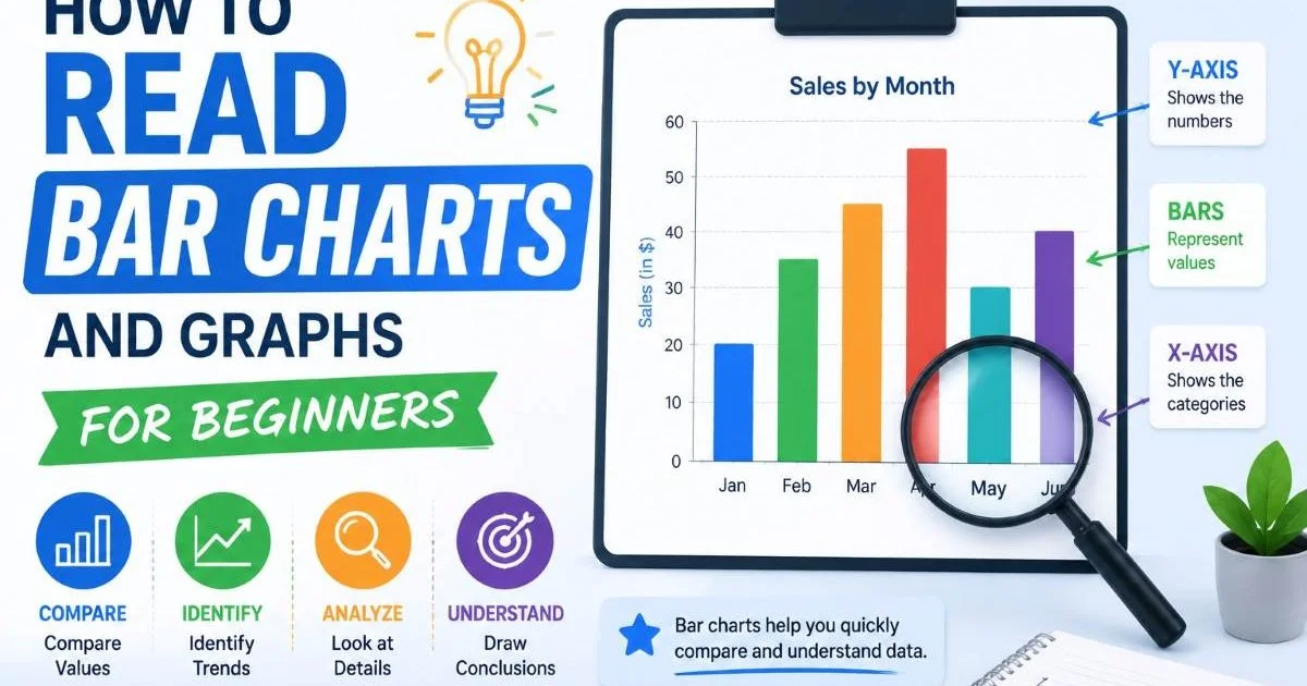
Line charts are the most common tool for interpreting data trends visually. The x-axis typically represents time, while the y-axis represents the measurement. When reading these charts, pay attention to the scale. A chart with a y-axis starting at 95 instead of 0 can make a 2% change look dramatic. Always check the axis labels before drawing conclusions from any visualization.
Charts with truncated y-axes can visually exaggerate small differences. Always check where the axis starts.
What Correlation Really Means
Correlation measures the strength and direction of a linear relationship between two variables. A correlation coefficient ranges from negative 1 to positive 1. A value near positive 1 means both variables increase together; near negative 1 means one increases as the other decreases. Near zero means no linear relationship exists. For example, ice cream sales and drowning incidents are positively correlated, but buying ice cream obviously doesn't cause drowning. Both increase during summer because of heat.
"Correlation tells you two things move together. It says absolutely nothing about whether one causes the other."
This is the single most misunderstood concept in statistical results explained to general audiences. News articles frequently confuse correlation with causation. A study might find that people who eat breakfast tend to weigh less, but that doesn't prove eating breakfast causes weight loss. People who eat breakfast might also exercise more, sleep better, and make other healthy choices. Establishing causation requires controlled experiments, not just observational correlation. The distinction is not academic; it has real consequences for policy decisions, medical treatments, and business strategy.
Common Misconceptions and How to Avoid Them
Mistakes Beginners Make
One of the most common errors is assuming that a larger sample always produces better results. Sample size matters, but sample quality matters more. Surveying 10,000 people from a single city about national preferences will produce biased results no matter how large the sample. Similarly, beginners often treat statistical significance as proof of practical importance. A drug that lowers blood pressure by 0.5 mmHg might be statistically significant with a large enough sample, yet clinically meaningless for patients.
Another frequent mistake involves cherry-picking data to support a predetermined conclusion. If you analyze 20 variables and find that one shows a statistically significant result, that single finding could easily be a false positive. This is known as the multiple comparisons problem. Quality analysis in any domain, whether in code analysis that detects hidden vulnerabilities or medical research, requires systematic methodology rather than selective reporting.
Before analyzing data, write down your hypothesis. This prevents unconscious cherry-picking of favorable results.
Building Better Analytical Habits
Start by questioning every number you encounter. Who collected this data? How was the sample chosen? What's the margin of error? These questions are not signs of distrust; they are signs of analytical maturity. Good statistical analysis is as much about knowing what your data cannot tell you as it is about extracting what it can. Transparency about limitations strengthens conclusions rather than weakening them.
Practice with real datasets rather than textbook examples. Government open data portals, Kaggle competitions, and public health databases offer free datasets that come with real-world messiness: missing values, outliers, and ambiguous categories. Working through these challenges builds skills that sanitized classroom exercises simply cannot replicate. Start small, ask a clear question, pick the right measure, visualize your findings, and always report your methods alongside your results.
Frequently Asked Questions
?How do I know when to use inferential vs. descriptive statistics?
?Can correlation ever be strong enough to prove causation?
?How long does it realistically take to clean data before analyzing it?
?Is variance useful on its own, or do I always need it alongside the average?
Final Thoughts
Statistical analysis doesn't require a math degree. It requires curiosity, a healthy skepticism toward numbers, and a willingness to ask "what else could explain this?" The concepts covered here, from probability and statistics fundamentals to reading charts and understanding variance, form the foundation for every data-driven decision.
Start with small datasets, practice consistently, and resist the urge to jump to conclusions before examining your data from multiple angles. The goal isn't perfection; it's building the habit of thinking critically about every number that crosses your screen.
Disclaimer: Portions of this content may have been generated using AI tools to enhance clarity and brevity. While reviewed by a human, independent verification is encouraged.