How to read bar charts and graphs for beginners is one of the most practical skills you can build when starting your data journey. Bar charts appear everywhere: in business reports, news articles, academic papers, and financial dashboards. Yet many people skim past them without extracting the real story hidden in the bars.
Understanding these visual tools lets you make faster, more informed decisions and spot trends that raw numbers alone might obscure. If you've ever felt intimidated by a chart in a presentation or confused by overlapping bars in a report, this guide is for you.
We'll walk through four concrete steps that will transform you from a passive chart viewer into a confident data reader. By the end, you'll know exactly what to look for and how to avoid common misinterpretations.
Key Takeaways
- Every bar chart has five core components you must identify before drawing conclusions.
- Always check the axis scale first; truncated axes can distort your interpretation dramatically.
- Comparing bar heights only works reliably when bars share the same baseline and scale.
- Grouped and stacked bar charts serve different analytical purposes you should recognize immediately.
- Practice reading real-world charts weekly to build lasting chart interpretation confidence.
Step 1: Identify the Five Core Components
Understanding Axes and Labels
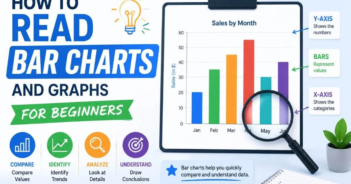
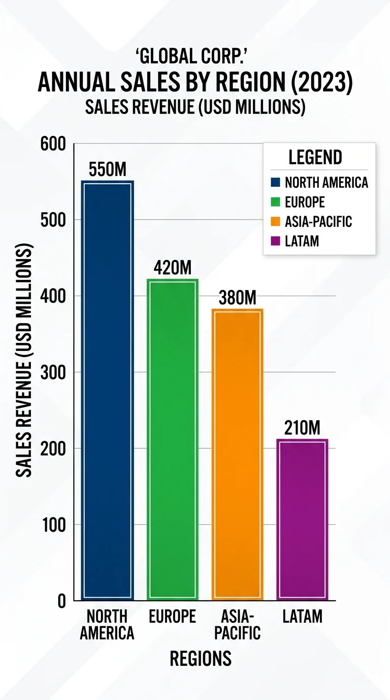
Before you analyze anything, slow down and identify what the chart is actually showing you. Every bar chart has a title, an x-axis (horizontal), a y-axis (vertical), bars, and usually a legend. The title tells you the subject and scope, while the axes define what's being measured and in what units. Skipping this step is like opening a book to a random page and trying to understand the plot.
The x-axis typically represents categories (months, products, regions), while the y-axis represents a numerical value (revenue, count, percentage). In horizontal bar charts, these roles are swapped. Make sure you read the axis labels carefully, because a chart showing "units sold" tells a very different story than one showing "revenue in thousands." This distinction matters for accurate chart interpretation and is a foundational part of statistical analysis at any level.
Reading the Legend
The legend explains what each color or pattern represents. In a simple single-series bar chart, you might not need one. But when multiple data series appear, such as "2023 sales" versus "2024 sales" shown side by side, the legend becomes your decoder ring. Without reading it first, you risk confusing one dataset for another entirely.
Legends are typically placed to the right of the chart or directly above it. Some interactive charts let you click legend items to toggle data series on and off. If you're working with data in a statistics for beginners context, get in the habit of reading the legend before your eyes even land on the bars. This simple discipline prevents the majority of misreadings beginners experience.
Read the chart in this order: title first, then axes, then legend, and only then the bars themselves.
Step 2: Analyze the Scale and Baseline
The scale on the y-axis determines how dramatic or subtle the differences between bars appear. A chart that starts at zero gives you an honest visual proportion. But a chart whose y-axis starts at, say, 90 instead of zero will make a difference between 92 and 98 look enormous, even though it's only a 6-point gap. This is one of the most common ways charts mislead readers, intentionally or not.
Spotting Truncated Axes
To spot a truncated axis, look at where the y-axis begins. If it doesn't start at zero, the visual differences between bars are exaggerated. Some fields (like stock price analysis) intentionally use non-zero baselines to highlight small but meaningful changes. The key is recognizing when this is appropriate and when it distorts reality. In most cases involving beginner-level statistical data, starting from zero gives the most honest picture.
Also check whether the scale uses consistent intervals. If one gridline represents 10 units and the next represents 50, the chart's visual proportions will be unreliable. Consistent spacing (10, 20, 30, 40) gives your brain the right framework to estimate values at a glance. This is especially relevant when you move into probability explained topics or trend analysis, where even small scale distortions can lead to wrong conclusions.
Dual-axis charts can trick beginners into seeing correlations that don't exist. Approach them with extra skepticism.
Step 3: Compare Bars and Extract Patterns
Now that you understand the chart's structure and scale, it's time to actually read the data. Start by identifying the tallest and shortest bars, which represent the maximum and minimum values. Then look at the overall shape: are the bars roughly equal, gradually increasing, or wildly inconsistent? This bird's-eye pattern recognition is often more valuable than memorizing individual numbers.
Next, compare specific bars that interest you. If you're looking at quarterly revenue, you might ask: did Q4 outperform Q1? By how much? Use the gridlines to estimate values rather than guessing from bar height alone. This approach to analysis basics builds the kind of quantitative thinking that scales into more complex work. Professionals doing financial planning with AI tools rely on the same fundamental skill of reading visual data accurately before feeding it into models.
"The first question to ask any bar chart is not "what's the biggest bar?" but "what's the story across all the bars?""
Grouped vs. Stacked Bar Charts
Grouped bar charts place bars side by side for each category, making it easy to compare individual values across series. For example, a grouped chart might show monthly sales for three products, with three bars per month. This format excels at direct comparison. However, it gets cluttered with more than three or four data series, making patterns harder to spot.
Stacked bar charts pile segments on top of each other within a single bar. They're great for showing total values and the composition of those totals simultaneously. The tradeoff is that only the bottom segment has a consistent baseline, making it harder to compare middle or top segments across categories. Learning how to read bar charts and graphs for beginners means understanding which chart type answers which question. Use grouped charts for "which segment is biggest?" and stacked charts for "what's the total and how is it divided?"
Understanding this distinction is part of the broader workflow of turning raw data into actionable insight. Whether you're reading a chart manually or automating reports, knowing which format suits your question saves time and prevents errors.
Step 4: Interpret the Data Story and Avoid Mistakes
Reading a bar chart is not just about identifying numbers; it's about forming an interpretation. Ask yourself: what story is this data telling? A chart showing declining monthly sales across six months tells a different story than one showing seasonal dips that recover every year. Context matters enormously. Always consider the time period, the data source, and what might be missing from the chart before forming a strong opinion.
One valuable habit is to verbalize your interpretation. Say it out loud or write it down: "Product A grew 50% from Q1 to Q4, while Product C grew 52%, meaning C is gaining ground despite lower absolute numbers." This forces precision and helps you catch sloppy reasoning. How to read bar charts and graphs for beginners ultimately comes down to building this interpretive muscle through repetition.
Common Beginner Mistakes
The most frequent mistake is confusing correlation with causation. Two bars going up together doesn't mean one caused the other. A chart showing that ice cream sales and sunburn cases both rise in summer doesn't prove ice cream causes sunburn. This principle sits at the heart of sound statistical reasoning and becomes even more relevant when you encounter probability topics in your learning journey.
Another common error is ignoring sample size or data source. A bar chart showing "customer satisfaction" based on five responses carries far less weight than one based on five thousand. Always look for footnotes or source citations on the chart. If none exist, treat the data with healthy skepticism. Similarly, watch out for cherry-picked time ranges that make trends look better or worse than the full picture warrants.
A beautifully designed chart is not automatically a trustworthy chart. Always verify the underlying data when possible.
Finally, resist the urge to over-interpret small differences. If two bars differ by only 1 or 2 percent, and you don't know the margin of error, calling one "better" than the other is statistically unjustified. How to read bar charts and graphs for beginners involves knowing when the data supports a strong claim and when it simply doesn't. This restraint separates thoughtful analysis from noise.
Frequently Asked Questions
?How do I read a stacked bar chart differently than a grouped one?
?How long does it take to get comfortable reading bar charts?
?Why does a truncated y-axis make bar chart differences look bigger?
?Is reading the legend really necessary for simple single-series bar charts?
Final Thoughts
Learning how to read bar charts and graphs for beginners is a skill that pays off immediately and compounds over time. Start with the basics: identify components, check the scale, compare bars methodically, and interpret with context.
Practice weekly with real charts from news sites or financial reports. The more charts you read critically, the faster your instincts develop. Within a few weeks of deliberate practice, you'll find yourself catching misleading visuals that once would have fooled you completely.
Disclaimer: Portions of this content may have been generated using AI tools to enhance clarity and brevity. While reviewed by a human, independent verification is encouraged.